Predictive Analytics
Predictive Analytics lets you compute an estimate of future values of a kpi:
This documentation is about the Predictive Analytics options to add predictions in a curves chart or in a bar chart. These predictions are based on a linear regression algorithm. In Serenytics, you can also compute advanced predictive analytics in Python, but this is not the topic here.
Predictive analytics options for a widget are in the section Predictive Analytics in its configuration. To be able to configure it, the dimension selected on the X-Axis of your widget must be of type datetime.
Fields of the Predictive Analytics section are explained here:
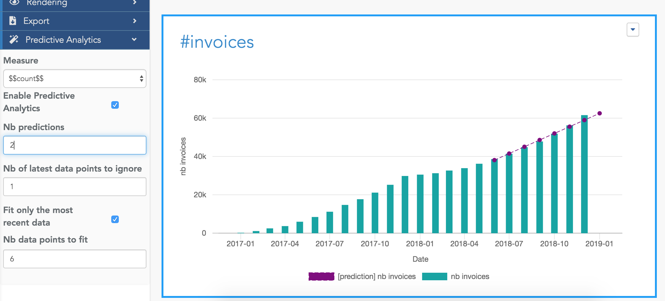
Measure
Select the measure your want to approximate and predict. And click on the Enable Predictive Analytics checkbox.
Nb Predictions
Nb of points to predict in the future. For example, if your widget is configured to show data by month, the algorithm
will predict and show Nb predictions months.
Nb of last data points to ignore
This is the number of most recent data points to ignore when computing the regression on your data.
For example, if your widget shows a measure by month, and this parameter is set to 1, the latest month data will not be used in the computation.
The default value is 1, because in most situations, the latest data point is the current one (e.g. the current month) and because it is incomplete, we don't want to include this data in the computation (it would add a strong negative bias to the result).
Fit only the most recent data
By default, this option is set to false. This means the computation uses all the data points (except the latest one(s)
excluded by the option Nb of last data points to ignore above).
But in some situations, you only want to use the latest data to predict the future. For example, you may want to consider only the last 6 months of data. In this case, set this option to 6.
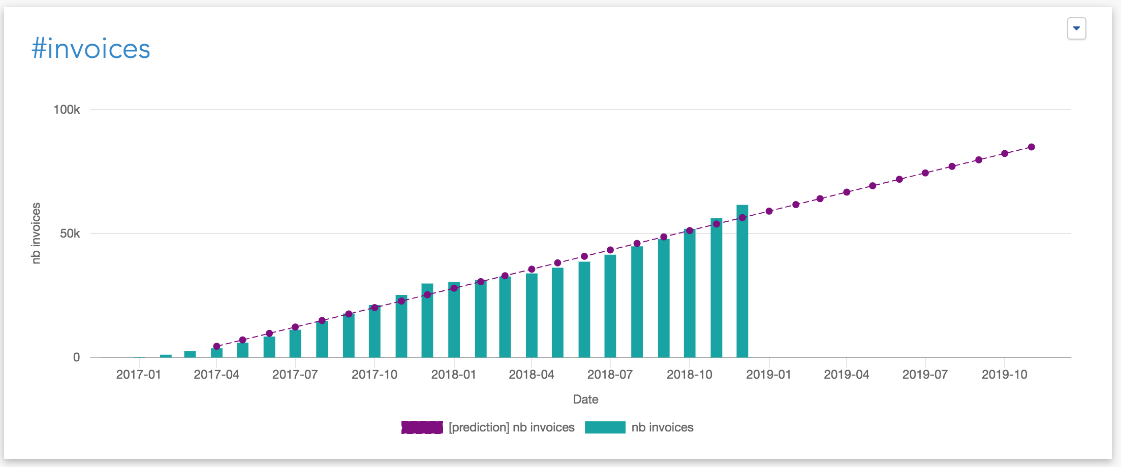
Configuration example
Here is an example of a set of options and their meaning:
The prediction line has 8 points in total:
-
the computation has used 6 data points to estimate the line (the 6 leftest points). We can see in this example that the line obtained by the regression is very close to the actual data points (i.e. the bars).
-
the algorithm has generated 2 predictions (the 2 last points).
Because we have ignored the last data point (using Nb of latest data points to ignore=1), among these two predictions:
-
the first one is for the latest month (i.e. the current month, represented by the last bar). In this example, we can see the green bar is above the prediction line for this last point. This means that for the current month, the results are above the trend based on the last 6 months.
-
the second one is for the coming month.